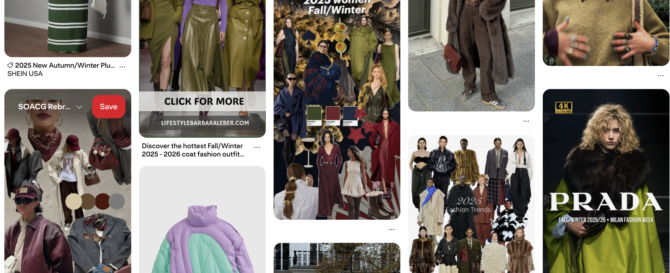
With Paris Fashion Week dominating timelines for the SS26 season, it feels only right to look back at what hit the runways earlier this year. While silhouettes always matter, it’s really the colors that set the tone and they’re about to take over.
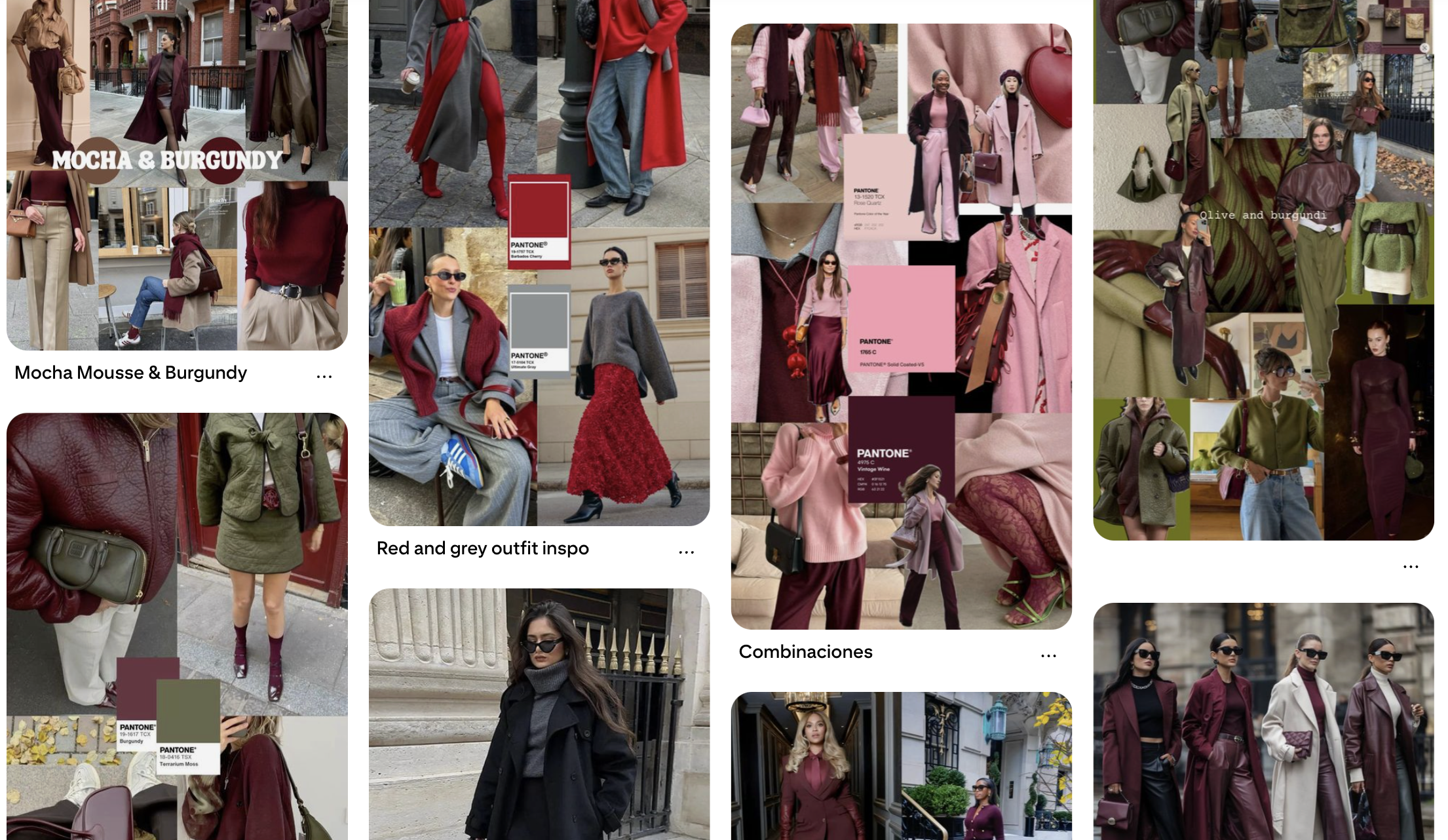
Pantone is always my go-to when I want to know which shades deserve my attention for the boutique or even when I’m shopping for myself. And, as always, they delivered with a palette that will shape the next few months.
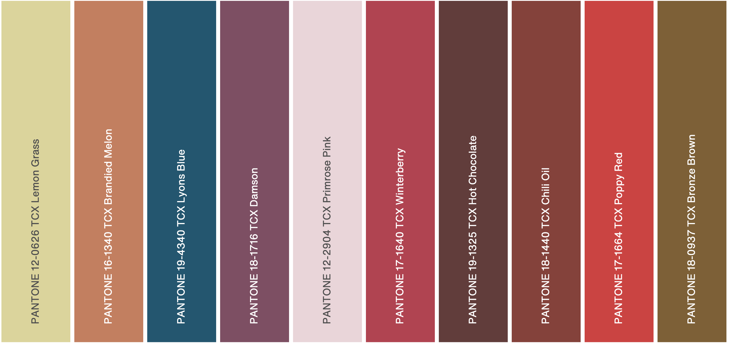
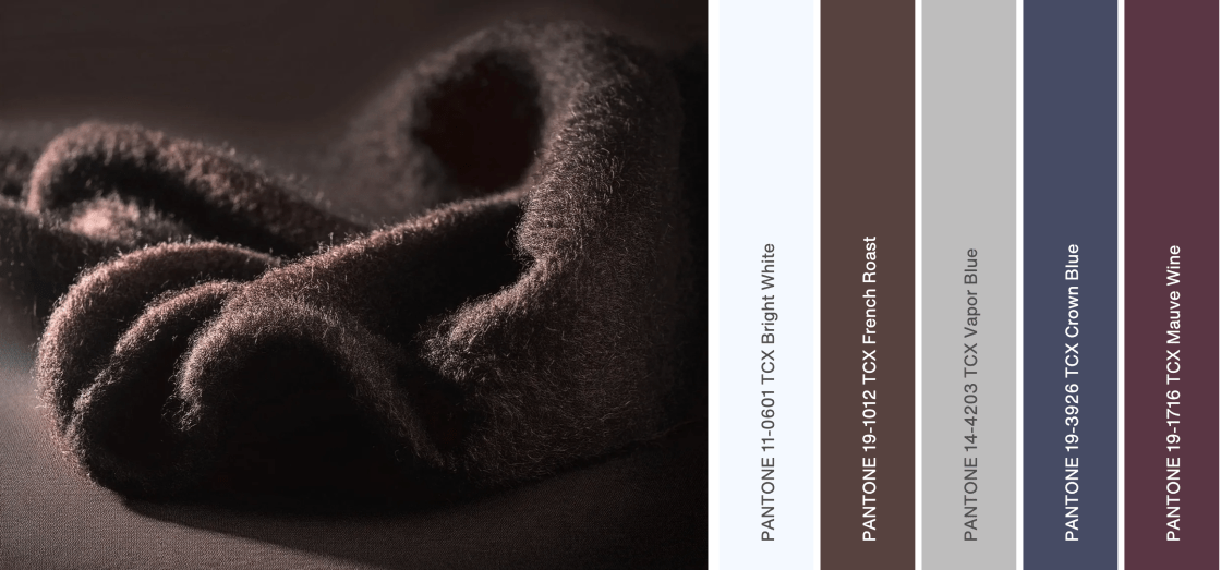
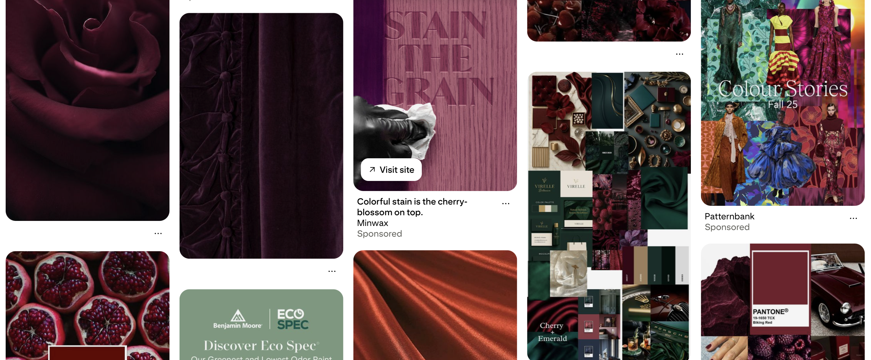
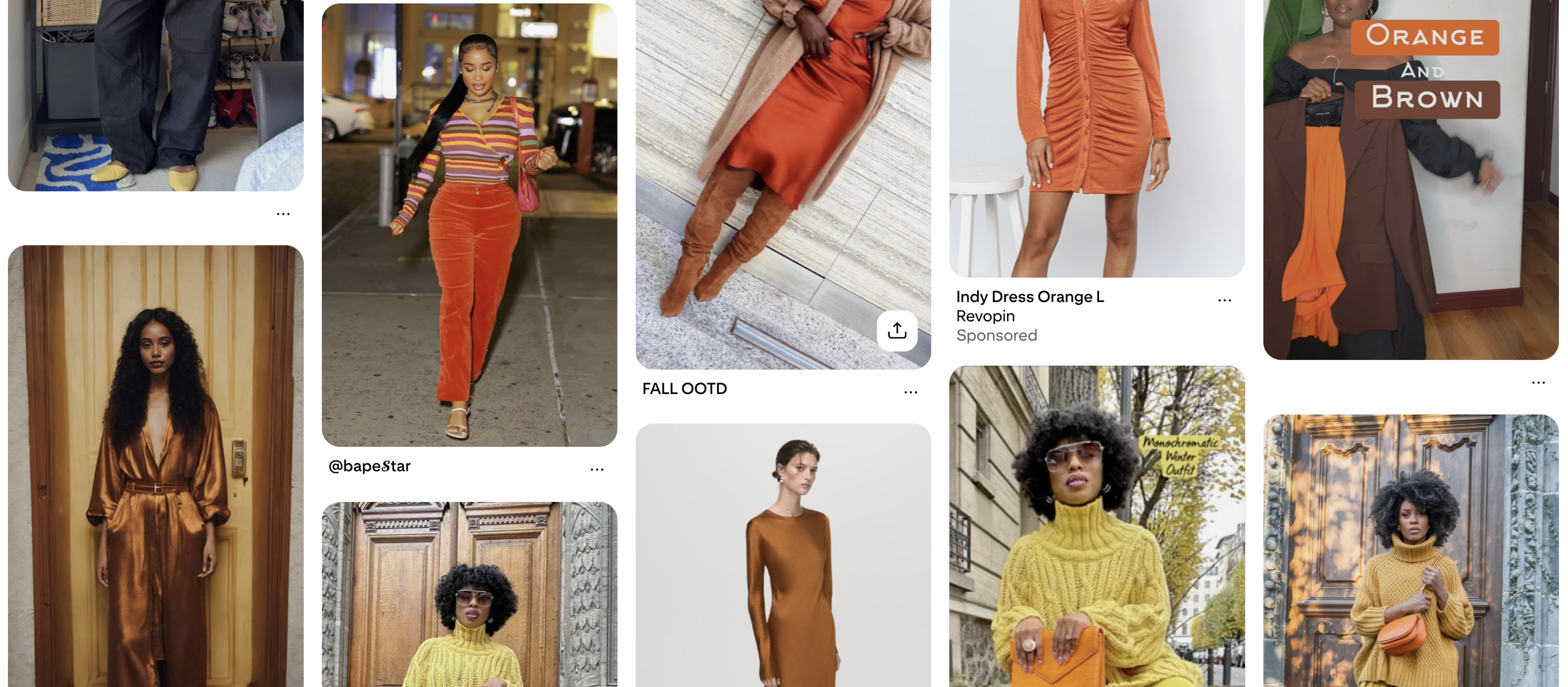
Everyone’s loving Mocha Mousse, Pantone’s Color of the Year, but my eye keeps drifting toward Chili Oil + Winterberry and Damson + Mauve Wine. On the runways and in the streets, they’ve shown up paired with bold brights or standing strong on their own. Pinterest hasn’t let me ignore them either. I’ve saved an overflow of looks that prove any shade, any depth of these tones just works.

And let’s not forget the neutrals. They’re no longer just a backdrop—they’re becoming the main character. Whether serving as the base of an outfit or standing alone as the look, they elevate instantly when layered.
So, get ready: these colors are about to creep into your shopping cart, your Pinterest boards, and maybe even your living room. Don’t resist the propaganda—you’ll enjoy it.
How will you make these colors work for you?
See you in the next one.
Xoxo, Jonice 💋
